To be able to answer to your question @angus, I need to know which version of the website homepage we are talking about: there are several Figma files containing different versions of the homepage:
@sganesh Yes, Hugo V1 has been the reference point. Nevertheless, I believe we are at a point where all of these designs, Hugo V1 included, are simply proposals. I believe @alexcrane was the primary designer in the past.
These initial proposals haven’t been updated in ~2 years to my knowledge.
Hey everyone. I’m interested in this topic in regards to the existing WordPress site and existing content like all sign-up and payment forms, blog posts, the Press section, Team + bios and all Support pages.
I think we lost analytics years ago, so not sure what the direct traffic is to some of these areas, but thought it worthwhile to check in with this team if there’s been an audit of everything to be replaced, or whether we need to maintain WordPress for certain things.
if you look at the new website text - you can see which pages are intended to be kept.
existing content like all sign-up and payment forms, blog, press/Team + bios (this page is being re-done) and all Support pages are intended to be kept from the menu.
if you think there’s something missing, let me know.
it would be an idea if you, angus and timothee meet to discuss this perhaps?
I downloaded the GitHub website repo, it works locally.
I compared the develop branch againt the Figma file: I took a screenshot of each page and paste it along its correspondig frame inside the Laptop 1024 (archive 210702) page
I also created a beta.stream.resonate.coop page with screenshots of the actual state of the player HOME, BROWSE and DISCOVERY pages
I took some time to observe and understand how the Figma projects and files have been structured and think about how to improve, re-organise, clean and document components and styles.
Now, I have some questions that I will share with you during our 2021-07-06T12:00:00Z meeting, specially about Resonate eco-system architecture (Player app vs Hugo website vs WordPress website) and design system (Figma files vs @resonate/tachyons).
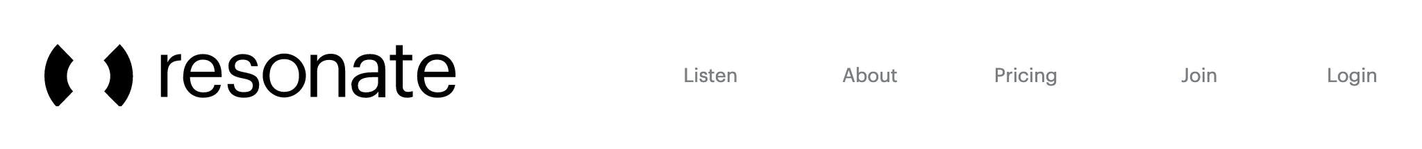
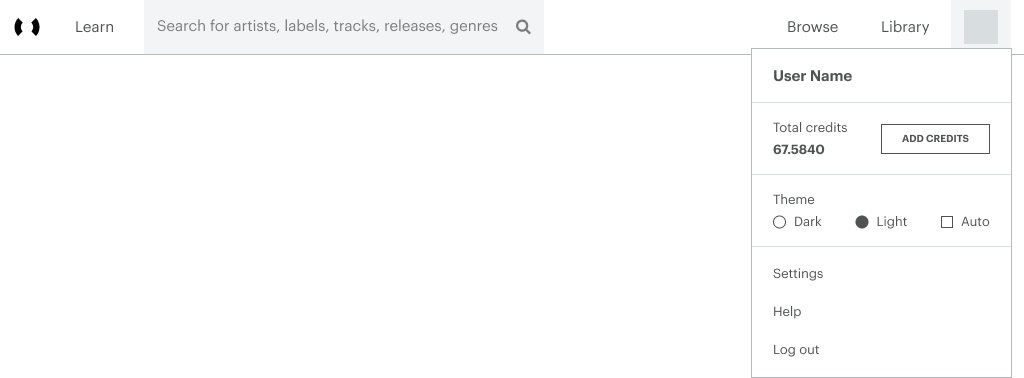
To follow the yesterday discussion about the Player & Website Epic with @angus@Hakanto and @auggod, here is my proposal for the new design of the shared header and footer. I didn’t work on the mobile version yet, because I would like to discuss and validate some important design decisions first, specially for the header that raises very important questions with huge impact on the whole Resonate user experience.
Goal: designing a unified header across the whole of Resonate (website + player) to help people better understand and navigate between the different pages, while having the feeling of staying within the same platform (like Bandcamp or Soundcloud).
Design decisions and questions:
Resonate logo: link to the homepage, should be always displayed on top left, works as a landmark for the user.
What is the homepage? It could be a different page depending on whether the user is logged in (Feed?) or not (Discover? Landing page?). What do you think?
Learn: link to a Learn page, which could be the new name for the current About page filled with the new text content written by @melis_tailored about the why and the how of Resonate, the manifesto, the coop and the stream2own model.
Search: full height search field, Search for artists, labels, tracks, releases, genres placeholder is always visible (like Bandcamp) as it helps people understand what can they search for.
Browse: not sure about the relevance of keeping this page. Right now, it links the Artists page with tabs to switch to Labels / Releases / Tracks pages, with ALL content listed (!): imagine having a Bandcamp / Spotify / Soundcloud page with all artists / labels / releases / tracks… it’s interesting with a small quantity of content, but I think this loses its relevance over time and as the catalog grows, except maybe if we offer ways of filtering and sorting content… Need your feedback on this.
Discover (not logged in): use Discover instead of Discovery to be consistant with other menu items which are verbs (Learn, Search, Browse), not nouns.
Library (logged in): user’s Favorites, Collection (owned trakcs), Playlists and History.
Log in: the question here is to define what is the most relevant CTA(s) to display regarding the Resonate onboarding journey. I see 3 options, with each specific meaning (do we all agree on these definitions?):
Sign up: creating a listener / artist / label account, necessary to buy credits to listen to music in the app
Log in: connecting to my existing user account in the app.
Join: becoming a member a coop
User avatar: display a popup window on hover (like Bandcamp), with:
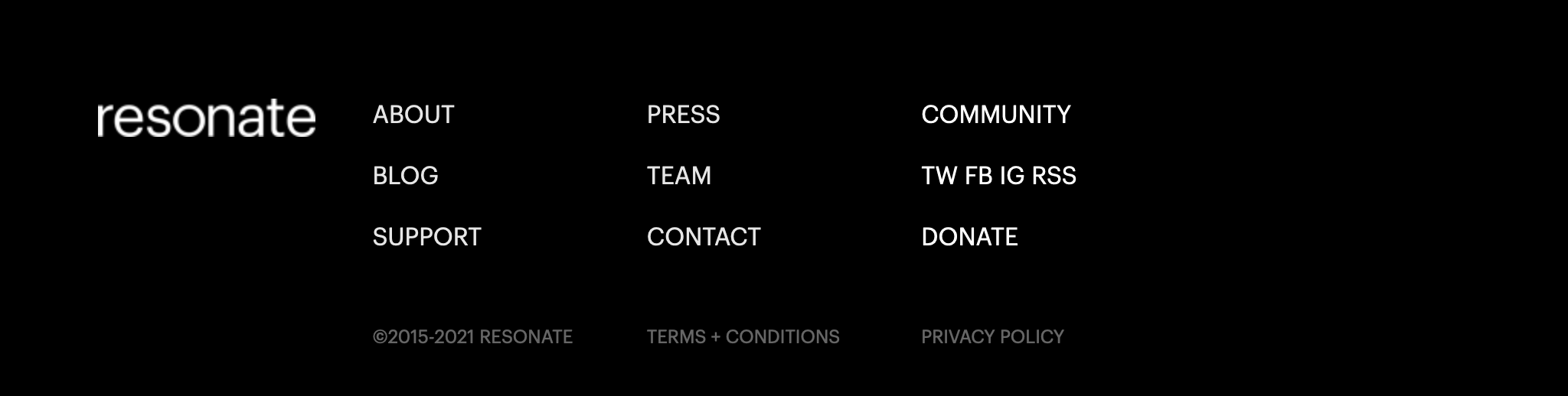
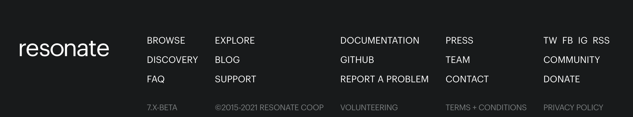
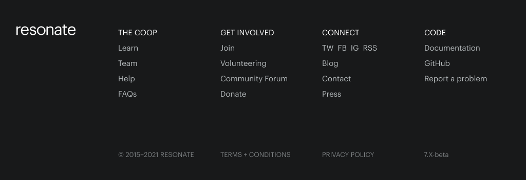
Goal: list the most useful links for all type of people (first time visitor, listeners, artists, journalists, developers, etc.) with clear and logical wording and grouping.
Questions:
are the submenu group titles the right ones? (The Coop, Get Involved, Connect, Code)
are the pages / links listed in each submenu the right ones and in the right order? Is something important missing or should we remove / rename some links?
That’s all for the moment! I hope it is clear enough, and if you have questions, suggestions and feedbacks, please share it here before 2021-08-07T22:00:00Z so we can have some time to discuss it together and update the design accordingly. Thanks
@peter@auggod tried out https://www.offen.dev/ …but by default it collected too much. Needed proper more specific requirements for setup I think.
In particular, we need to ‘meter up’ the new signup flow on the website. I.e. define essential logging events of our own and have a data structure that can record them.
I already have a few suggestions, ideas. More will come later.
Player Menu
I’m not sure we should change anything to the top right menu on the player (Browse, Discover, Library). The blank space (divider) was also intentional. I believe it’s more consistent like this between mobile/desktop.
See current player header (logged out/logged in state)
I didn’t expect the website to have a logged in state at all. On the website, I think a link button 'PLAYER could better than LOG IN. I also think the user should have the choice here to not log in or create an account yet. If we already have session, the id server will immediately redirect to the authorize/continue to the player thing. If we don’t have a session, the login page will show up and the user would have choice to login or just head to the player directly.
I don’t see why we should not have the dropdown menu with theme settings and more for logged out users.
A message ‘Your’re previewing Resonate’ while using the player as a guest should be shown.
Search
I agree the search input should be expanded by default, at least on desktop.
Being able to search both on the website/player would be great. An instant search as you type should immediately show if Resonate have something or not.
Browse
The browsing experience should indeed be enhanced with filters. (tags/genre, country, …, sorting) Maybe we can have a toggle button (show all/show only artists you’re following or have listened to)
In terms of SEO, the browse page is very useful too.