moved from basecamp backlogs
On the Create New Release Page, there are boxes that work like this:
- Enter text item: “hiphop”
- Press [+] to confirm
- Enter next text item: “alternative”
- Press [+] to confirm
- repeat

Problems:
- user can easily forget to click the Plus Button to confirm their final text item
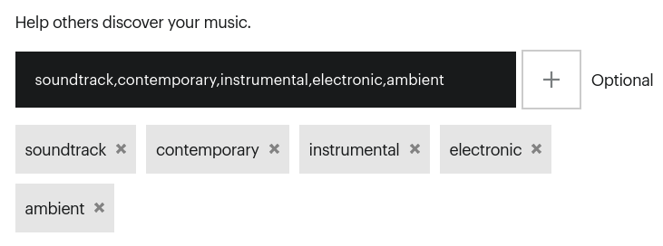
- if user returns to page to edit release-level information, it is misleading to see the presentation of the various items separated by commas. It makes user unsure if clearing this entry box would also delete the items. It misleads user to think that they could add multiple items by adding them all at once, separated by commas. This is not the case.
Proposed redesign:
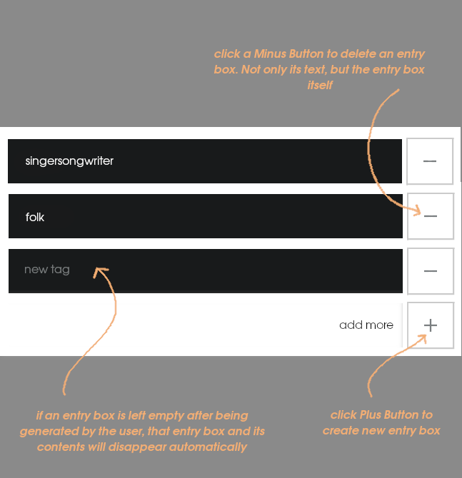
If a user returns to this page to edit information, this style of multiple-entry text boxes would appear the same as when they added the information. There would be no change in how the information was displayed. Each entry box would only ever display a single item.
